> ## Documentation Index
> Fetch the complete documentation index at: https://docs.gunp.la/llms.txt
> Use this file to discover all available pages before exploring further.
# Using plamotrack on a phone or tablet
> plamotrack lays itself out for the screen it is on: a tab bar and cards on a phone, an icon rail on a tablet. Add it to your home screen to open it like an app.
plamotrack is one web app that lays itself out for the screen it is on. There is nothing extra to install and no separate mobile site: open your instance's address in the phone's browser and sign in as you do on a computer. Everything you record lands in the same collection.
The layout follows the width of the window, not the kind of device:
| Width | What you get |
| ----------------------------------------------------------- | ------------------------------------------------------------------------------------- |
| Below 768 px — a phone | A tab bar at the foot of the screen, lists as cards, dialogs as full-screen sheets |
| 768 to 1279 px — a tablet, or a narrow window on a computer | A narrow rail of icons in place of the sidebar; tables that fold their columns to fit |
| 1280 px and wider | The desktop layout, with the full sidebar |
A tablet turned on its side, or a browser window dragged narrower, changes layout on the spot. A half-filled form keeps what you typed.
Your phone has to be able to reach your instance. On the same Wi-Fi as a [local or LAN install](/deployment/local-and-lan) that is the computer's address on your network. To reach it from the hobby shop, you need one of the [remote deployments](/deployment/overview).
## On a phone
 ### Getting around
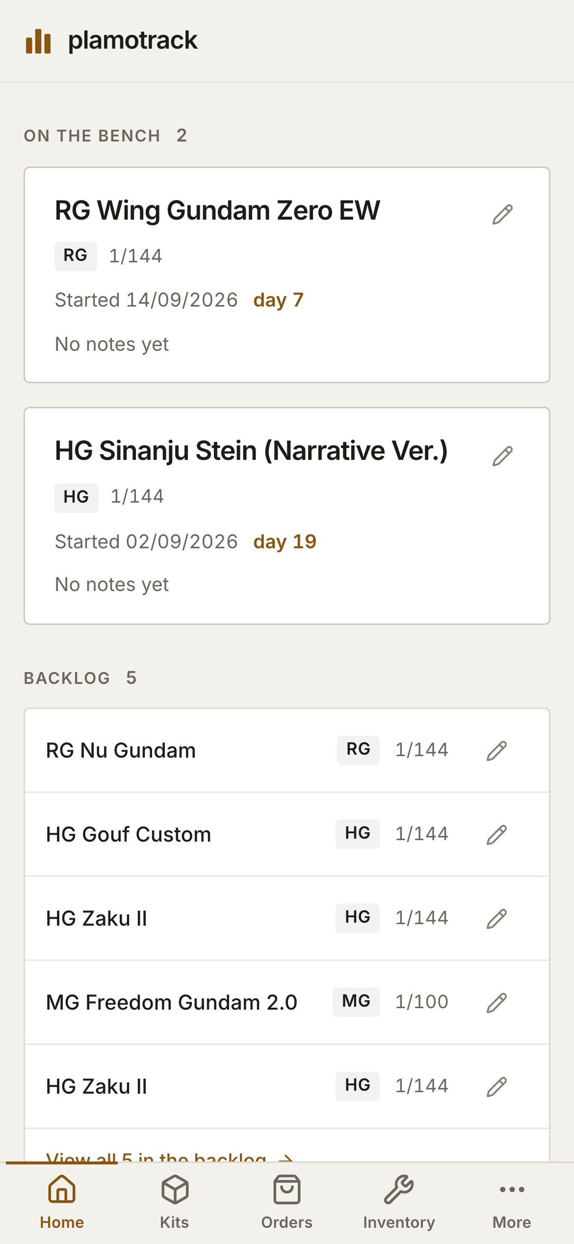
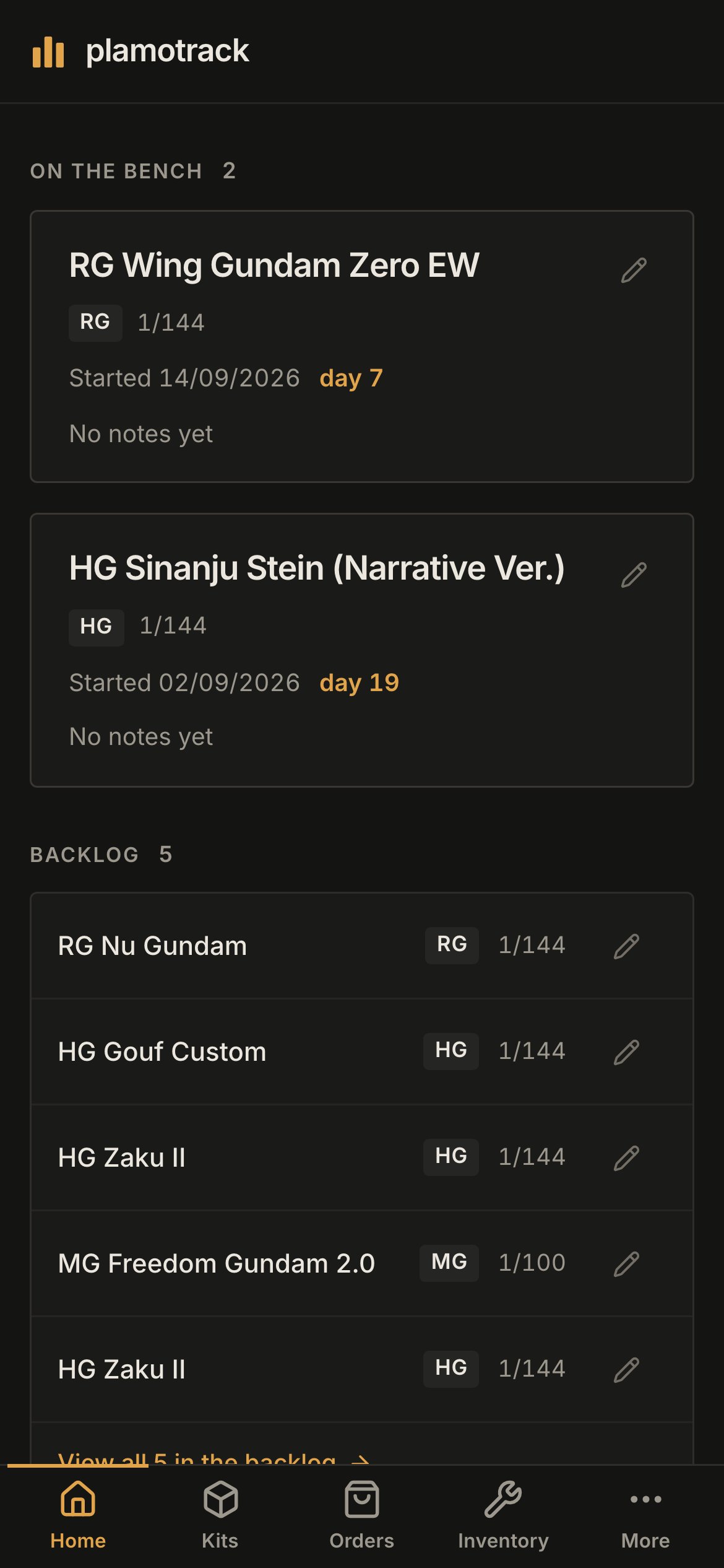
The tab bar has five tabs: **Home**, **Kits**, **Orders**, **Inventory** and **More**. **More** holds what the sidebar's lower half holds on a computer: **Retailers**, **Settings**, the theme choice and **Sign out**.
### Getting around
The tab bar has five tabs: **Home**, **Kits**, **Orders**, **Inventory** and **More**. **More** holds what the sidebar's lower half holds on a computer: **Retailers**, **Settings**, the theme choice and **Sign out**.
 ### Home
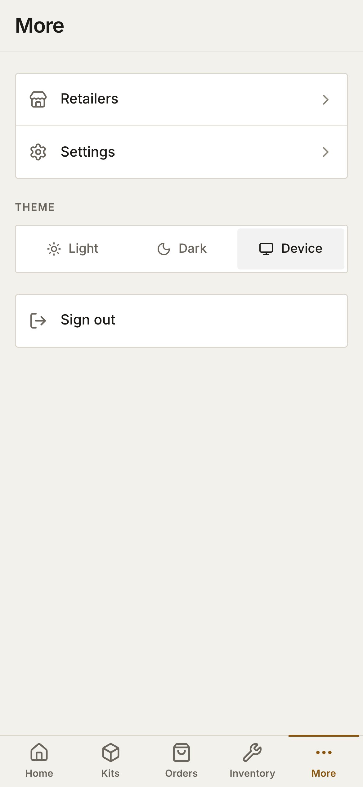
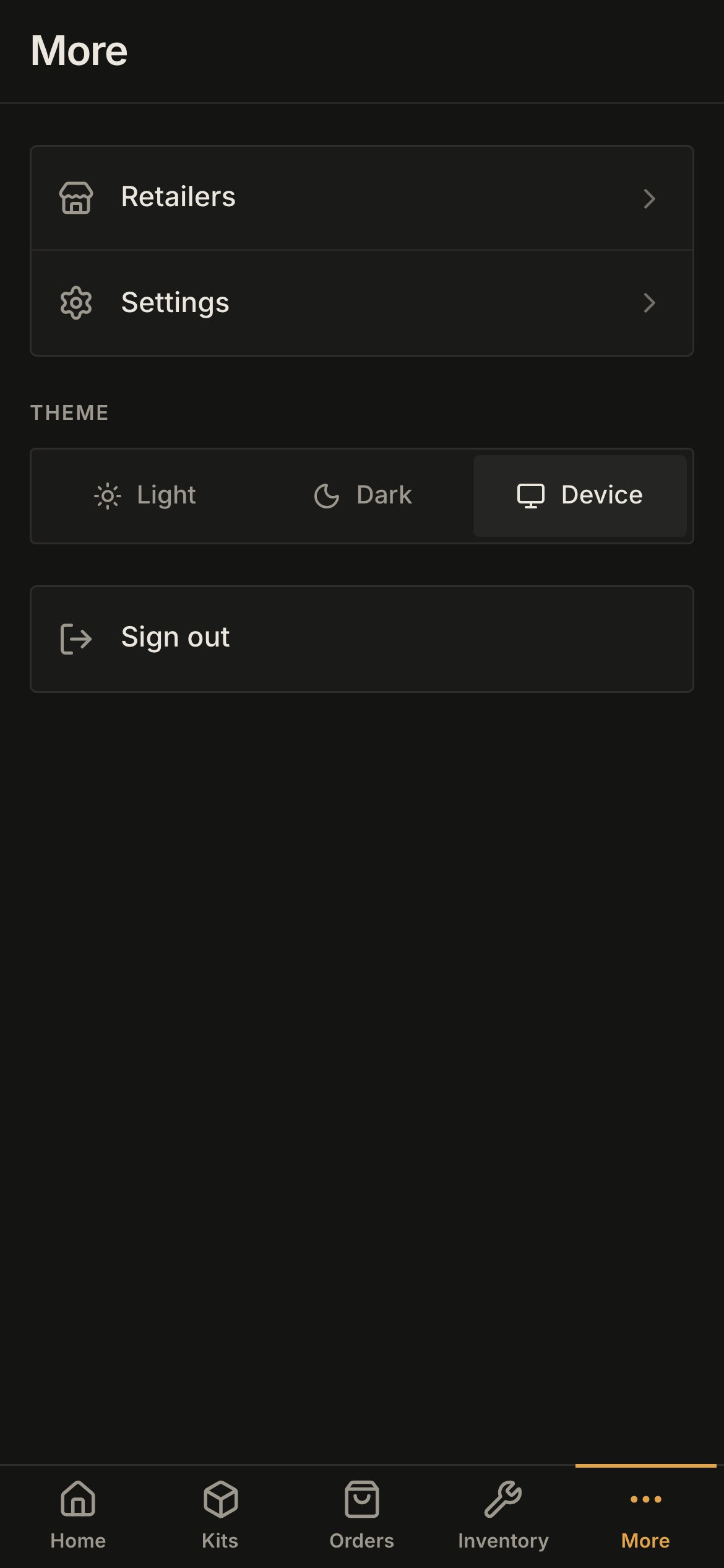
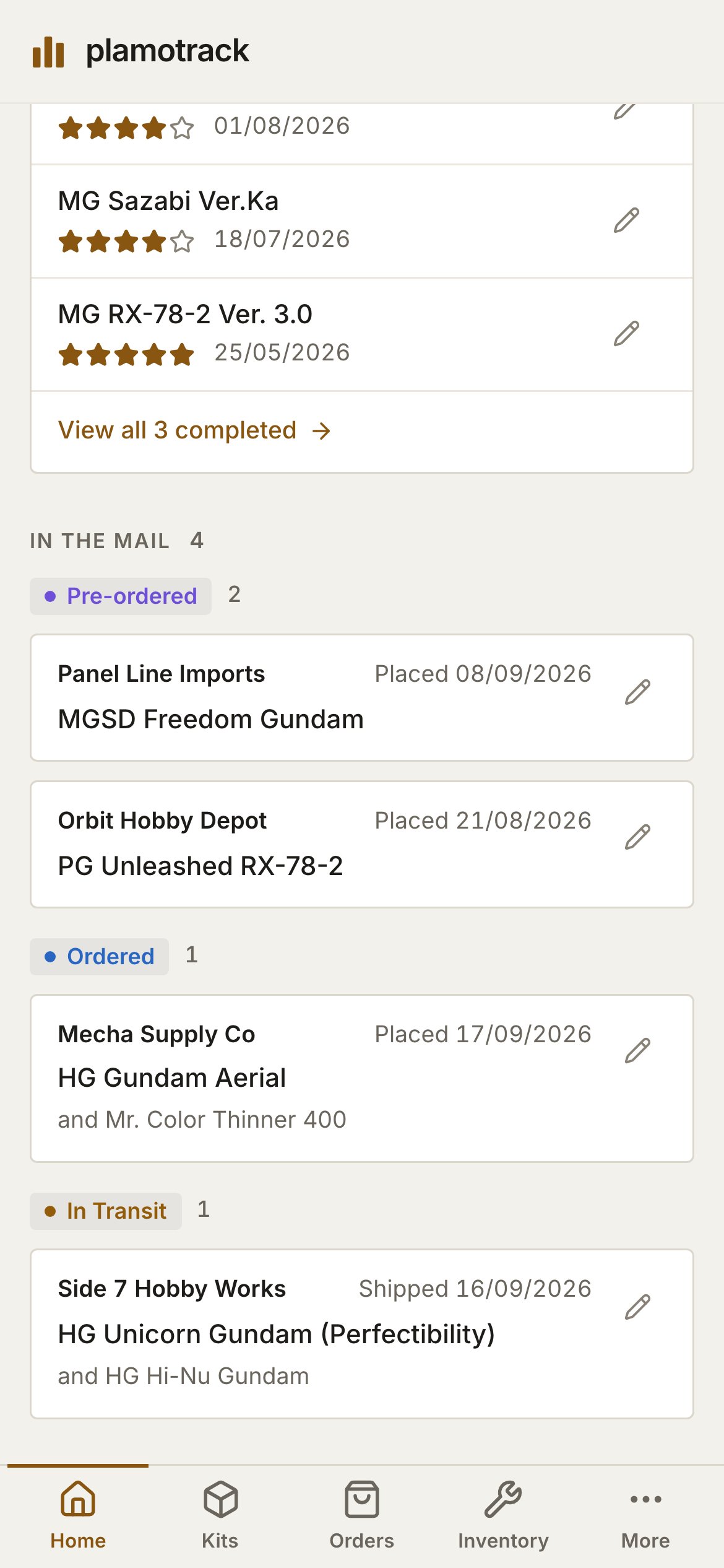
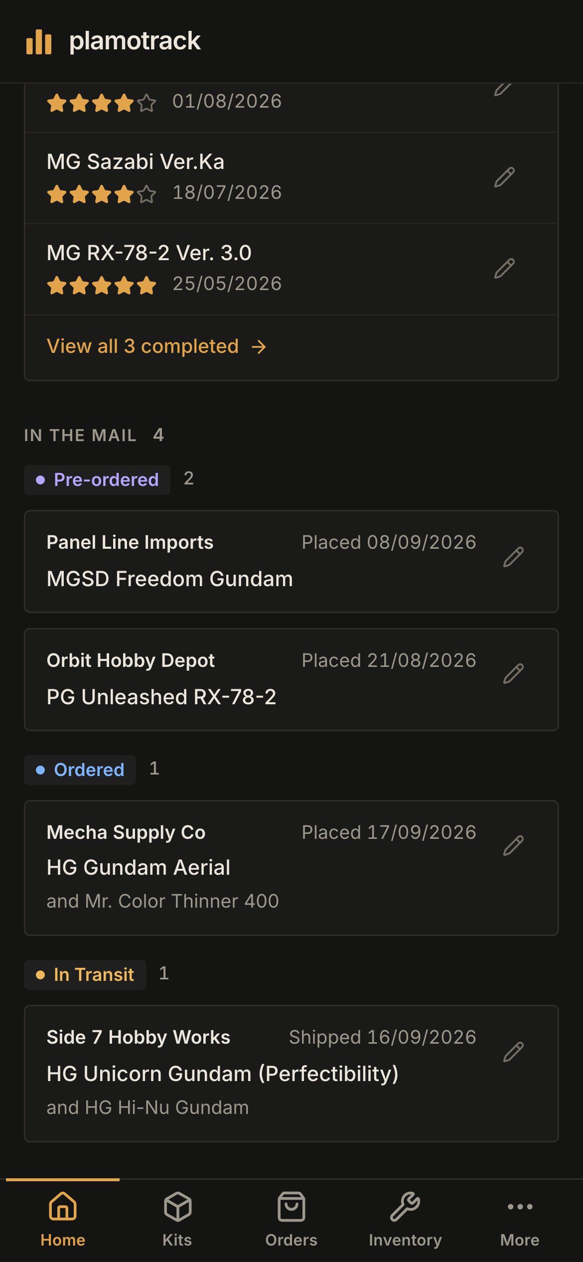
Home is one column. **On the bench** comes first, then **Backlog** and **Recently completed**, then **In the mail** as three groups — **Pre-ordered**, **Ordered** and **In Transit** — one under the other on a phone held upright. Where there is room for two side by side — a large phone on its side, a small tablet — the groups sit two abreast. The pencil on any card opens that kit or order for editing.
### Home
Home is one column. **On the bench** comes first, then **Backlog** and **Recently completed**, then **In the mail** as three groups — **Pre-ordered**, **Ordered** and **In Transit** — one under the other on a phone held upright. Where there is room for two side by side — a large phone on its side, a small tablet — the groups sit two abreast. The pencil on any card opens that kit or order for editing.
 ### Lists, filters and sorting
**Kits**, **Orders**, **Inventory** and **Retailers** show a card for each row. Tap the pencil on a card to edit it. On **Orders**, tap the card itself to see the order's lines.
On **Kits** and **Orders**, the search box stays at the top of the list and everything else — status, series, retailer, sort order — lives behind one button beside it.
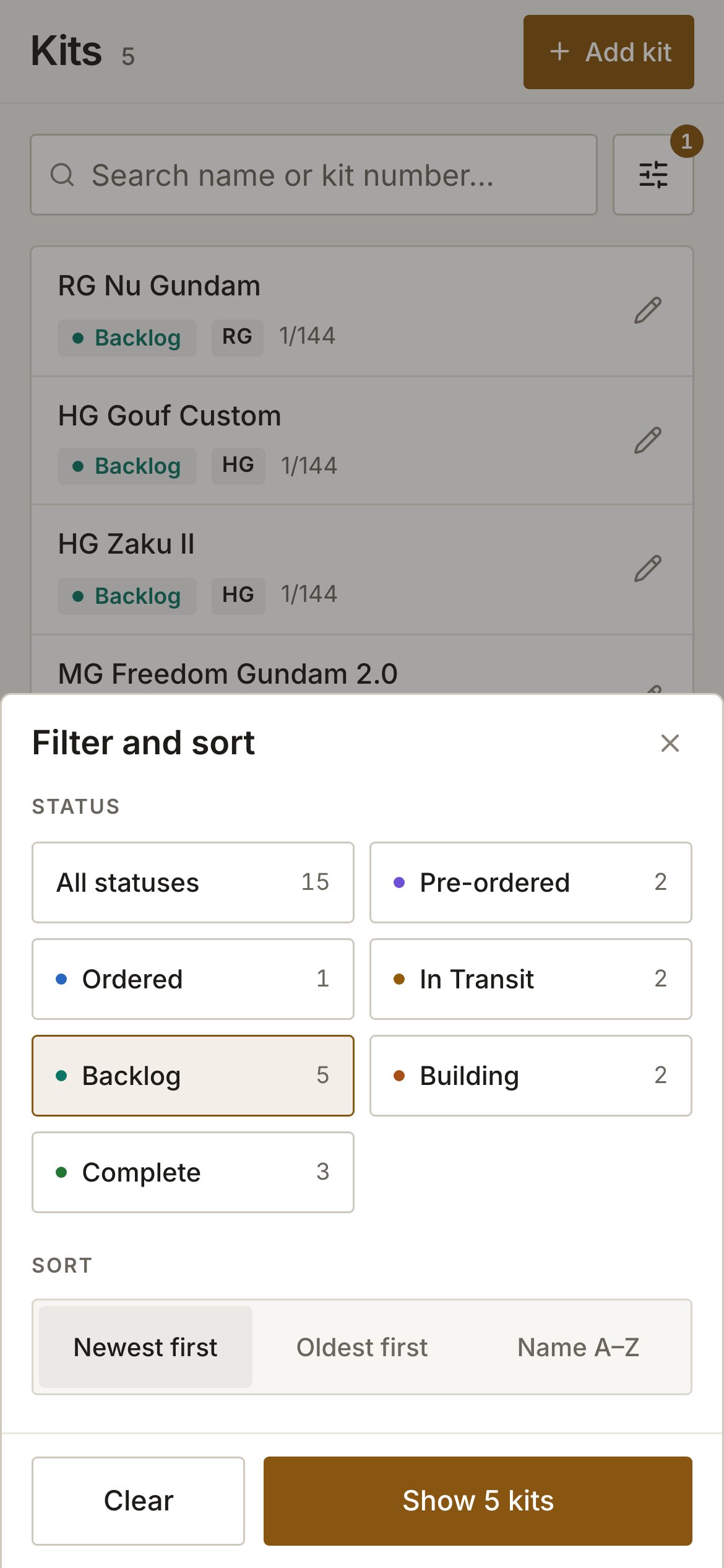
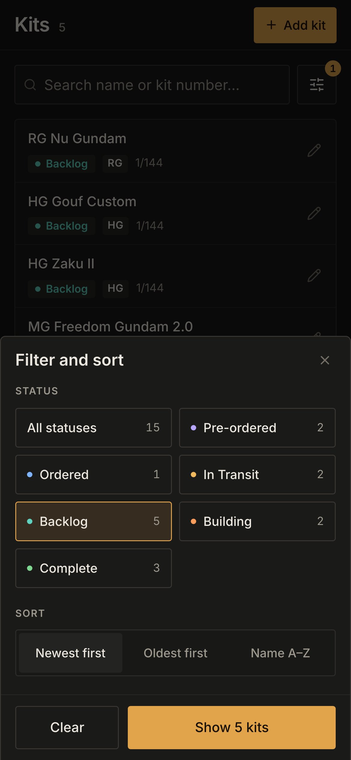
Tap the **Filter and sort** button to the right of the search box. A badge on the button counts the filters already in effect.
Pick a status, a series or a sort order. Each status shows how many kits it holds, and the button at the foot of the sheet counts what your choices will show.
Tap **Show … kits**. Tap **Clear** to reset the choices, or close the sheet to leave the list as it was.
### Lists, filters and sorting
**Kits**, **Orders**, **Inventory** and **Retailers** show a card for each row. Tap the pencil on a card to edit it. On **Orders**, tap the card itself to see the order's lines.
On **Kits** and **Orders**, the search box stays at the top of the list and everything else — status, series, retailer, sort order — lives behind one button beside it.
Tap the **Filter and sort** button to the right of the search box. A badge on the button counts the filters already in effect.
Pick a status, a series or a sort order. Each status shows how many kits it holds, and the button at the foot of the sheet counts what your choices will show.
Tap **Show … kits**. Tap **Clear** to reset the choices, or close the sheet to leave the list as it was.
 A filtered list has its own address, exactly as on a computer, so a bookmark or a **view all** link from Home opens already filtered.
### Recording an order
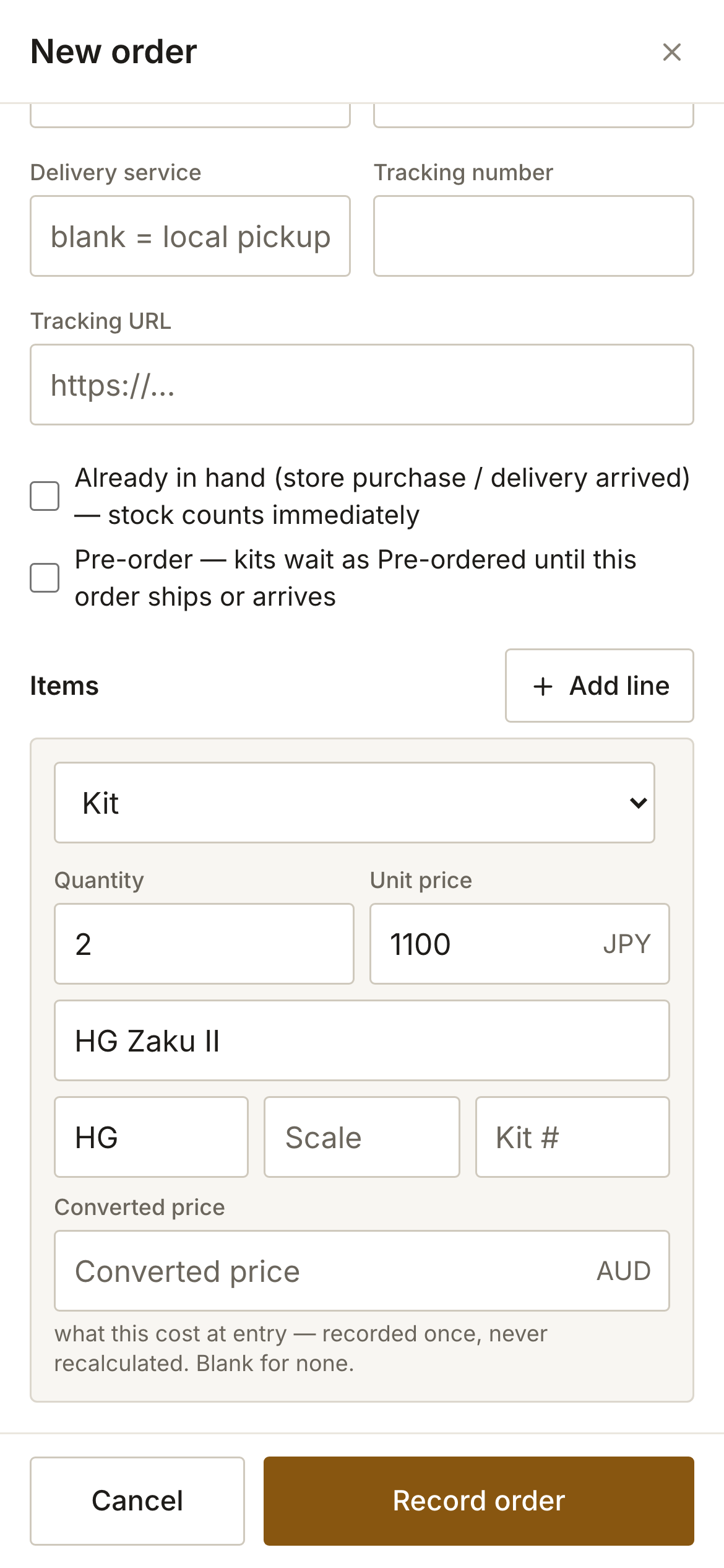
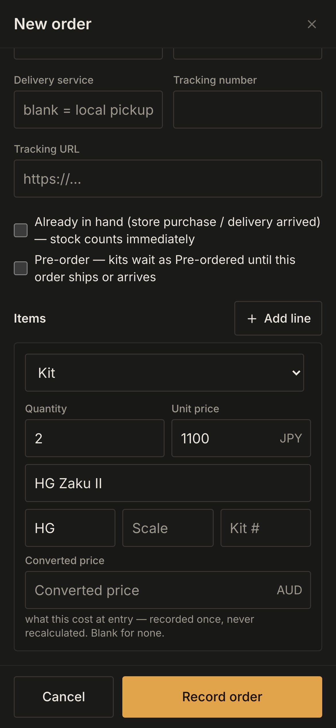
Every dialog opens as a full-screen sheet. Its buttons — **Cancel** and **Record order**, say — sit in a bar at the foot of the screen, where they stay while you scroll the form. In **New order**, each line is a card of its own: the type, the quantity and the price, then the kit's details or the catalog search.
A filtered list has its own address, exactly as on a computer, so a bookmark or a **view all** link from Home opens already filtered.
### Recording an order
Every dialog opens as a full-screen sheet. Its buttons — **Cancel** and **Record order**, say — sit in a bar at the foot of the screen, where they stay while you scroll the form. In **New order**, each line is a card of its own: the type, the quantity and the price, then the kit's details or the catalog search.
 The steps are the ones in [Kits & Orders](/using/kits-and-orders); only the shape differs.
### Counting stock
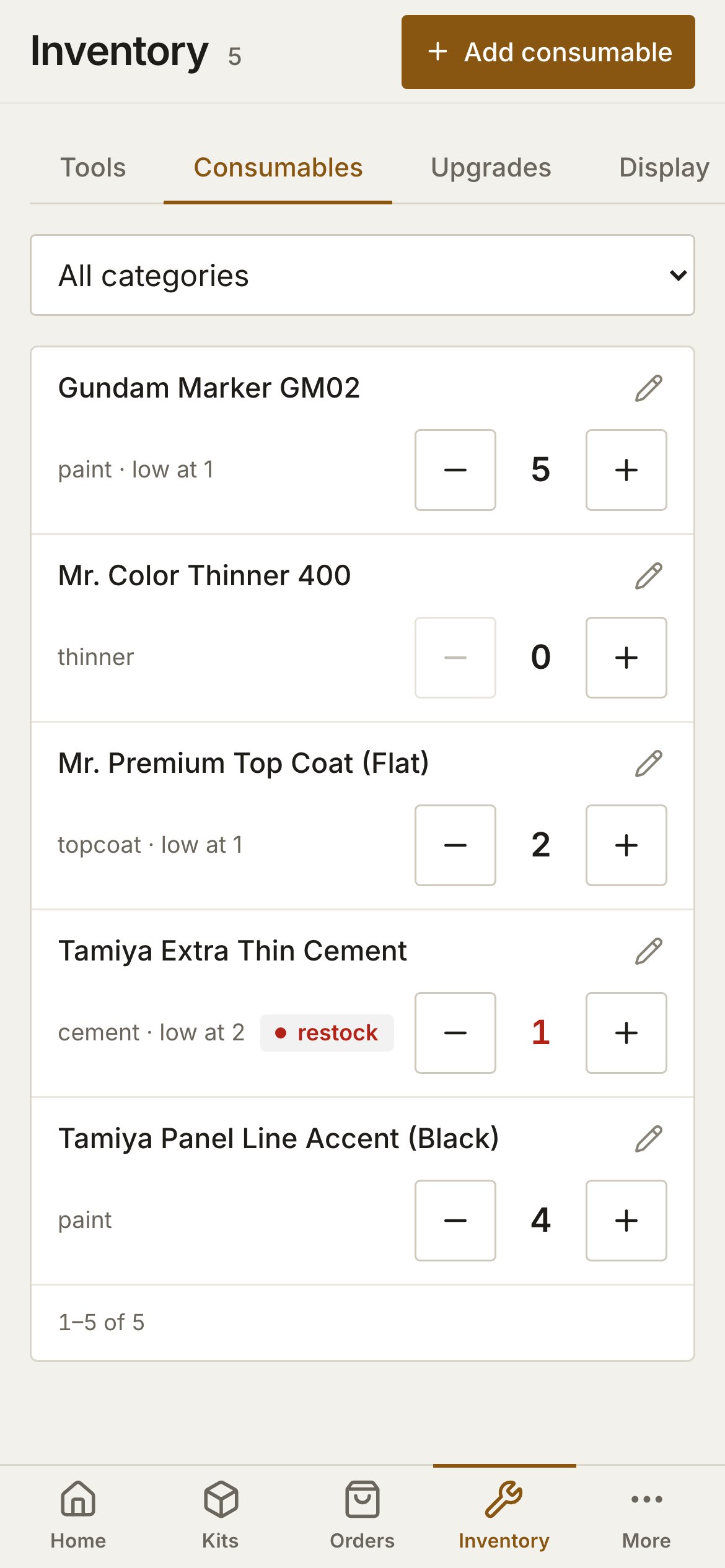
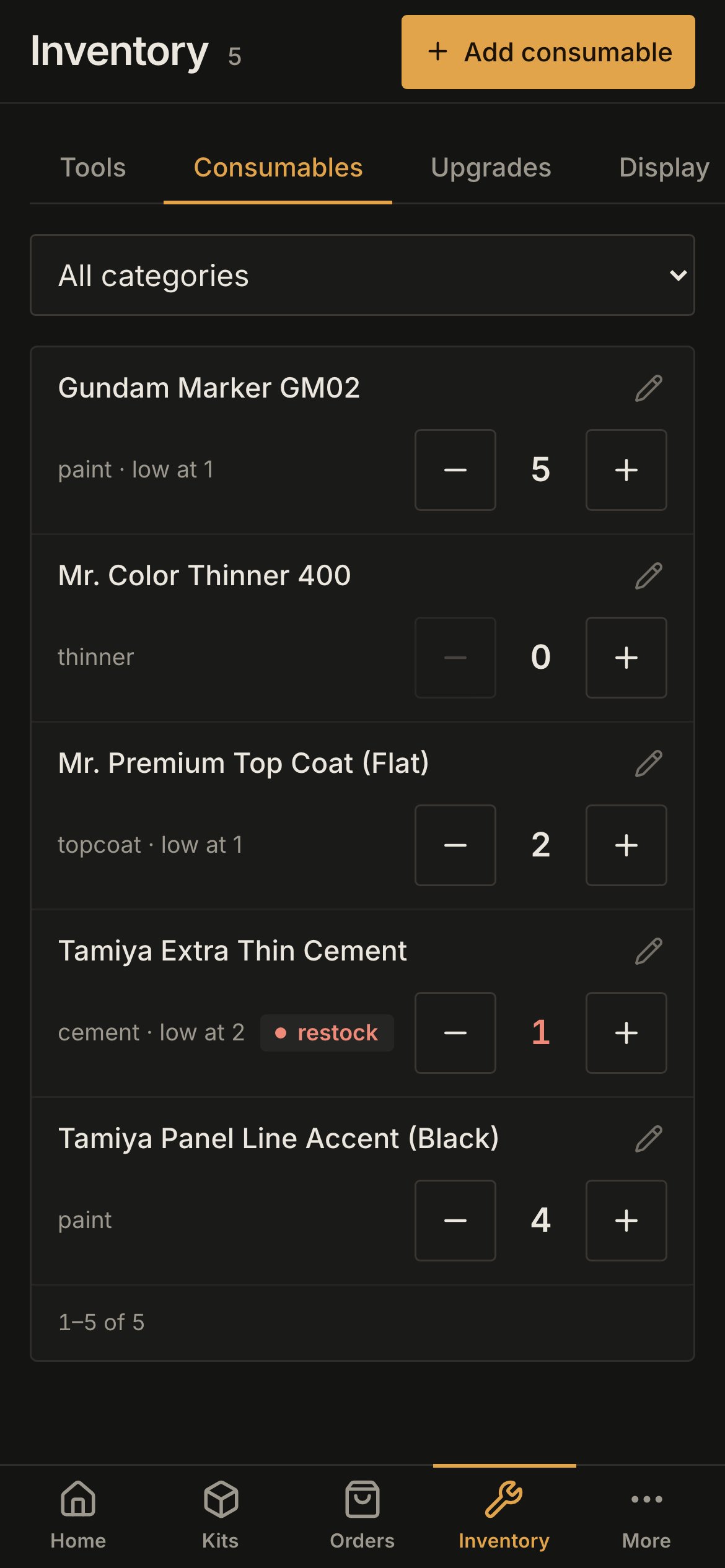
On **Inventory**, each card has a minus and a plus button either side of the count, sized for a finger. It is the quickest way to take one pot of cement off the shelf mid-build.
The steps are the ones in [Kits & Orders](/using/kits-and-orders); only the shape differs.
### Counting stock
On **Inventory**, each card has a minus and a plus button either side of the count, sized for a finger. It is the quickest way to take one pot of cement off the shelf mid-build.
 ### Settings
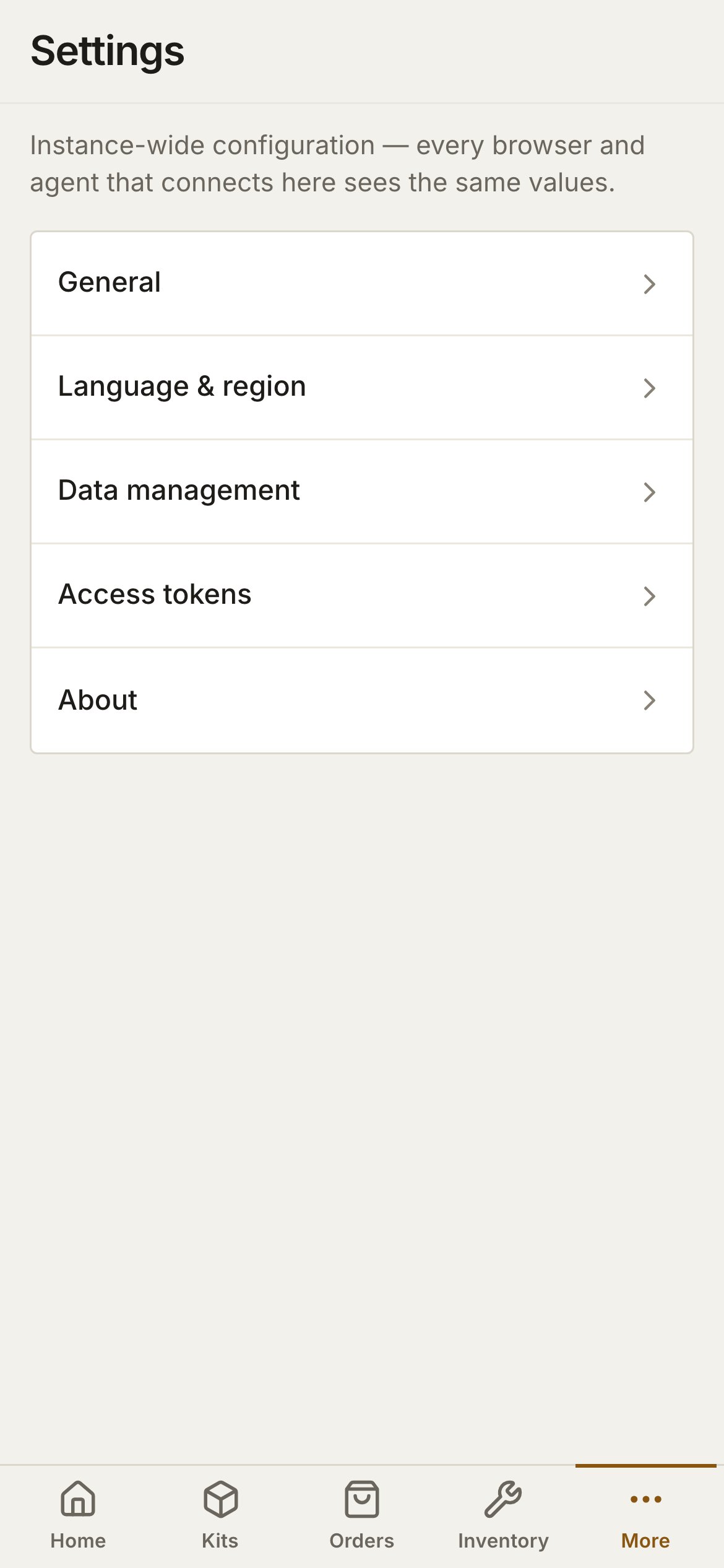
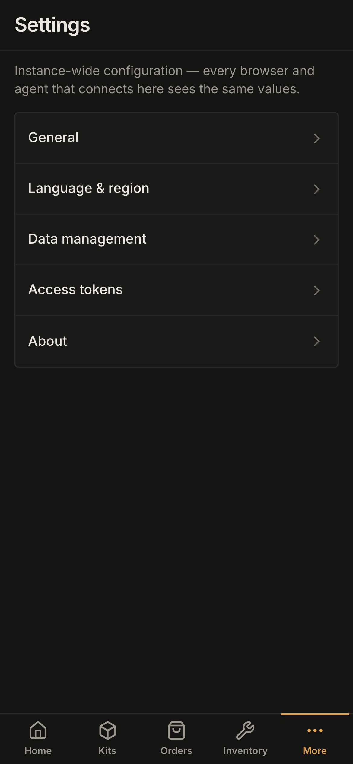
**Settings**, from **More**, opens as a list of its five sections. Tap one to open it; the arrow at the top left goes back to the list.
### Settings
**Settings**, from **More**, opens as a list of its five sections. Tap one to open it; the arrow at the top left goes back to the list.
 ### What a phone leaves out
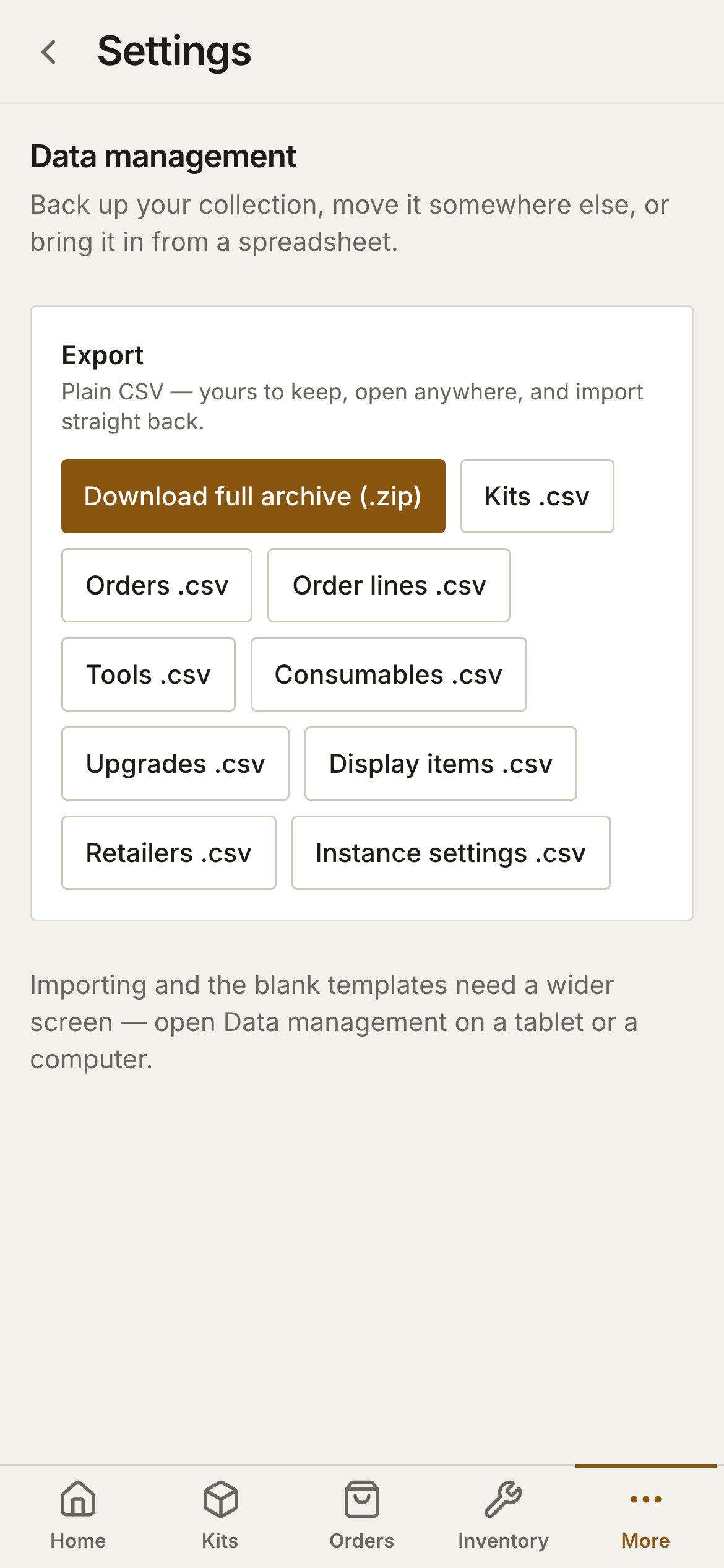
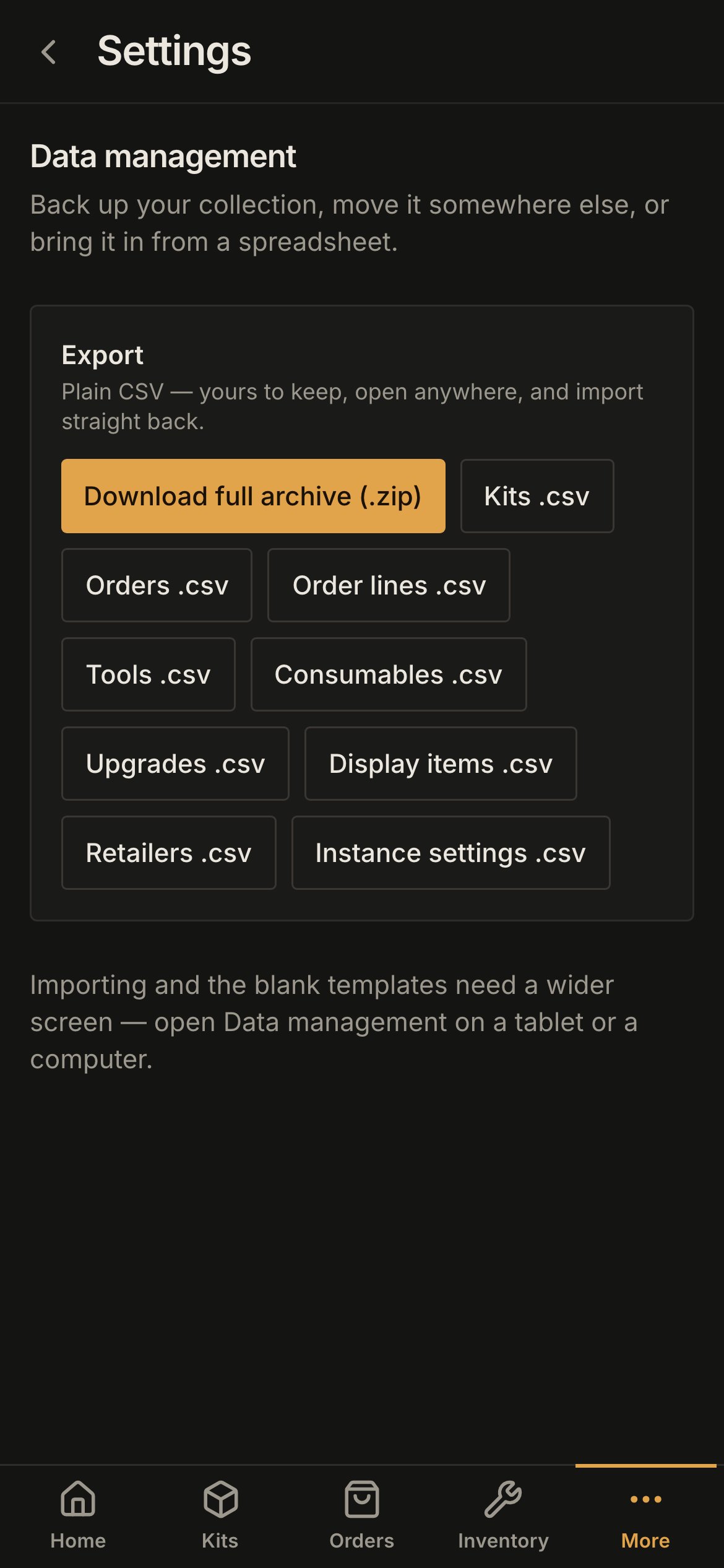
**Data management** on a phone offers the exports only: **Download full archive (.zip)** and the per-table CSV buttons. An archive saved to your phone is a fair quick backup. Importing and the blank templates need a screen at least 768 px wide — a tablet or a computer. The import preview is a set of wide tables, and **Replace everything** is the one action in plamotrack that deletes a collection; neither belongs on a small touch screen.
### What a phone leaves out
**Data management** on a phone offers the exports only: **Download full archive (.zip)** and the per-table CSV buttons. An archive saved to your phone is a fair quick backup. Importing and the blank templates need a screen at least 768 px wide — a tablet or a computer. The import preview is a set of wide tables, and **Replace everything** is the one action in plamotrack that deletes a collection; neither belongs on a small touch screen.
 Everything else is there: every page, every dialog and every field.
## On a tablet
From 768 px the sidebar becomes a rail of icons down the left edge — the same destinations, the theme control and **Sign out**, without their labels. Pages use the desktop's tables, and a table that is wider than its space folds columns away instead of scrolling sideways: on **Orders**, the order number tucks under the retailer's name, the shipped and received dates go under the status, and the tracking number moves into the order's expanded lines. Nothing is dropped; it moves.
Everything else is there: every page, every dialog and every field.
## On a tablet
From 768 px the sidebar becomes a rail of icons down the left edge — the same destinations, the theme control and **Sign out**, without their labels. Pages use the desktop's tables, and a table that is wider than its space folds columns away instead of scrolling sideways: on **Orders**, the order number tucks under the retailer's name, the shipped and received dates go under the status, and the tracking number moves into the order's expanded lines. Nothing is dropped; it moves.
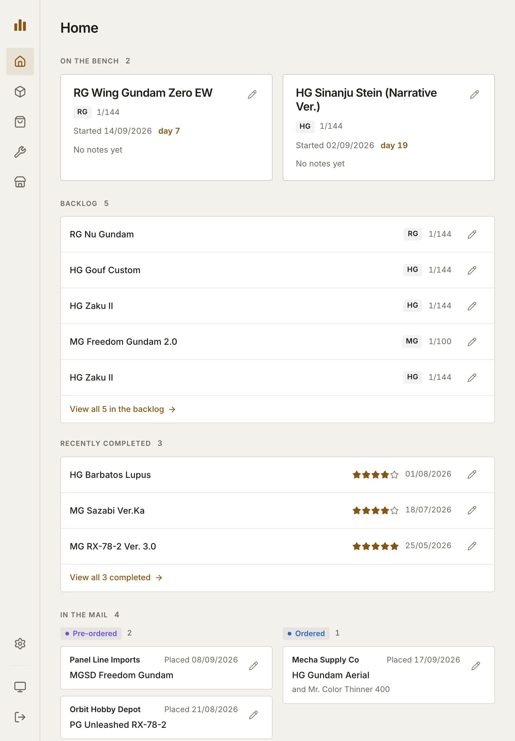
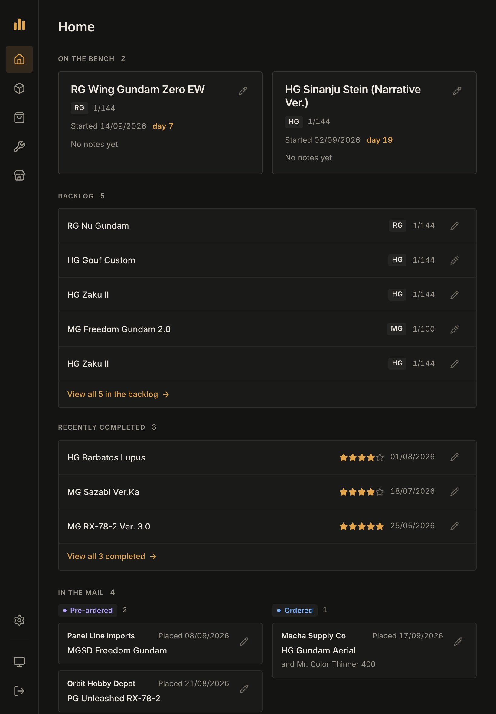
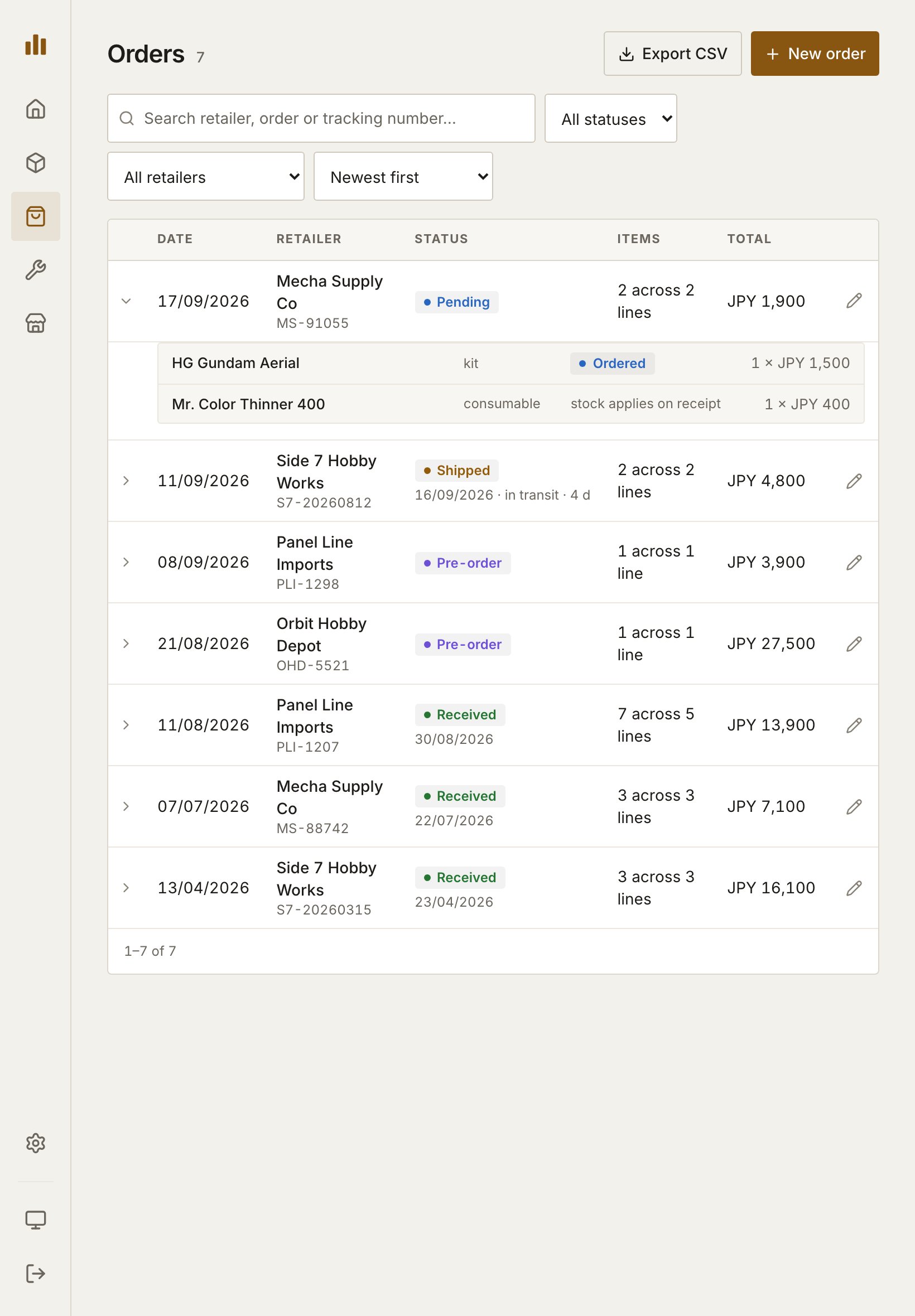
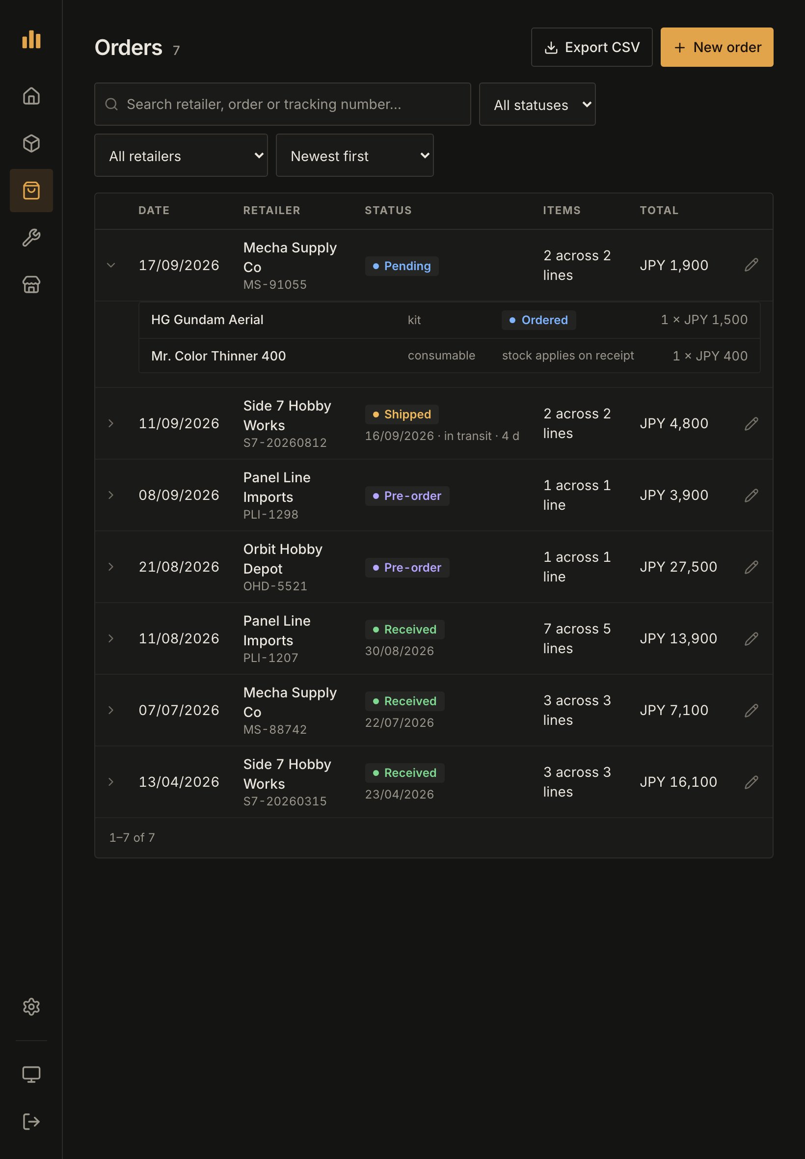 Buttons and controls are finger-sized on any touch screen, whatever its width. A tablet wide enough for the desktop layout — a 13-inch one on its side — gets the full sidebar with the larger controls. Dialogs are the desktop's centred panels, and **Data management** is complete, imports included.
## Add plamotrack to your home screen
Adding plamotrack to your home screen gives it an icon of its own and opens it in its own window, without the browser's address bar. You stay signed in: the home-screen app opens with the session your browser already had.
Sign in, so you know the address works from this device.
Tap the **Share** button, then **View More**, then **Add to Home Screen**. On an older iOS, **Add to Home Screen** is in the share menu's own list.
Keep the name or change it, then tap **Add**.
Sign in, so you know the address works from this device.
Tap the three-dot menu, scroll down, and tap **Install and create shortcut**.
Chrome offers two choices. **Install** adds plamotrack as an app: an icon on the home screen and in the app drawer, its own window, and an **Uninstall** button under the app's info like any other app. **Create shortcut** only adds an icon that opens the page in Chrome, address bar and all.
The icon is a way in to your server, not a copy of your collection:
* **There is no offline mode.** Without a connection to your instance, plamotrack cannot load or save anything.
* **Nothing is stored on the device** but your sign-in and your theme choice.
* **Removing it removes nothing else.** Delete the icon, or uninstall the app on Android, and your collection is untouched on the server.
## Large text
plamotrack follows your browser's text-size setting. On a phone, rows wrap and long names break onto further lines rather than pushing anything off the screen; this is checked up to two and a half times the default size on a phone 320 px wide.
Buttons and controls are finger-sized on any touch screen, whatever its width. A tablet wide enough for the desktop layout — a 13-inch one on its side — gets the full sidebar with the larger controls. Dialogs are the desktop's centred panels, and **Data management** is complete, imports included.
## Add plamotrack to your home screen
Adding plamotrack to your home screen gives it an icon of its own and opens it in its own window, without the browser's address bar. You stay signed in: the home-screen app opens with the session your browser already had.
Sign in, so you know the address works from this device.
Tap the **Share** button, then **View More**, then **Add to Home Screen**. On an older iOS, **Add to Home Screen** is in the share menu's own list.
Keep the name or change it, then tap **Add**.
Sign in, so you know the address works from this device.
Tap the three-dot menu, scroll down, and tap **Install and create shortcut**.
Chrome offers two choices. **Install** adds plamotrack as an app: an icon on the home screen and in the app drawer, its own window, and an **Uninstall** button under the app's info like any other app. **Create shortcut** only adds an icon that opens the page in Chrome, address bar and all.
The icon is a way in to your server, not a copy of your collection:
* **There is no offline mode.** Without a connection to your instance, plamotrack cannot load or save anything.
* **Nothing is stored on the device** but your sign-in and your theme choice.
* **Removing it removes nothing else.** Delete the icon, or uninstall the app on Android, and your collection is untouched on the server.
## Large text
plamotrack follows your browser's text-size setting. On a phone, rows wrap and long names break onto further lines rather than pushing anything off the screen; this is checked up to two and a half times the default size on a phone 320 px wide.